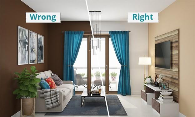
There’s a mystery many homeowners experience but rarely understand. You walk into a room that seems well-decorated — eve...
The Silent Symphony of Color: The 60/30/10 Rule
At the heart of that rhythm lies a quiet secret every great designer knows: the 60/30/10 rule.
A timeless guideline that teaches us how to create harmony, not chaos — calm, not clutter — beauty that feels effortless.

60% – The Dominant Color: The Foundation
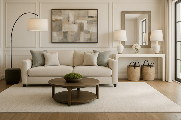
Every home needs an anchor. Your dominant color — the 60% — is the base note of your space, the tone that defines its emotional temperature.
It’s on the walls, the floors, the largest pieces of furniture — the background melody that holds everything together.
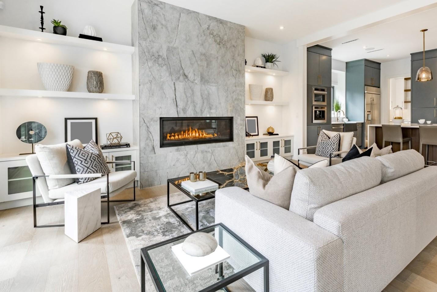
Soft neutrals like ivory, taupe, or greige create serenity and space.
Deep charcoals or navy tones add sophistication and quiet strength.
This color doesn’t demand attention. It whispers comfort.
It tells the rest of your palette: “You belong here.”

30% – The Secondary Color: The Support
Your secondary color — the 30% — gives structure and rhythm.
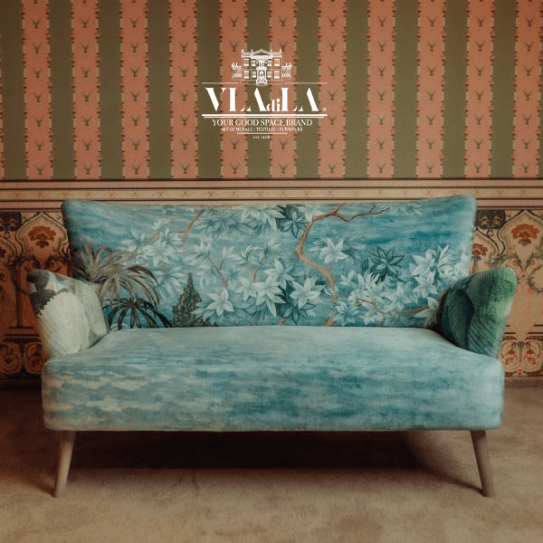
It appears in your curtains, your rugs, your smaller pieces of furniture.
It supports, enhances, and bridges the gap between foundation and expression.
A soft sage might cool down warm neutrals; a sandy beige can soften the formality of black and white.
It’s the language of harmony — where colors stop competing and start conversing.

10% – The Accent Color: The Spark
The accent is your space’s heartbeat — that final 10% that catches the eye and adds life.
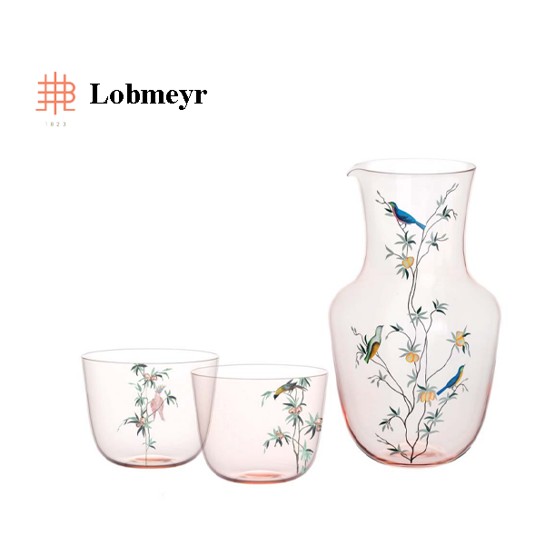
It’s a coral cushion on a linen sofa. A cobalt vase against white shelves. A single piece of art that dares to smile in a calm room.
Without it, a space risks feeling lifeless.
With it, your home begins to breathe with personality.
The Psychology of Color: How Hues Speak to the Heart
Color is more than decoration — it’s emotion made visible.
Each hue carries energy, and that energy shapes how we feel, move, and even think inside a space.
Neutrals calm the mind — they represent balance, purity, and timelessness. Perfect for bedrooms, living rooms, and places of rest.
Blues and Greens bring serenity and connection—the colors of sky and earth. They slow the pulse, reduce stress, and evoke trust and renewal.
Yellows invite joy and optimism—ideal for kitchens or creative spaces where sunlight meets inspiration.
Reds and Oranges energize and stimulate—beautiful in moderation, but powerful in accents rather than foundations.
Black adds grounding, sophistication, and contrast—like punctuation that gives clarity to a sentence.
White reflects purity and openness—it expands space but must be balanced with warmth so it doesn’t feel sterile.
When you understand color psychology, you begin to design not just for the eye but for the soul.
Harmony Is Not Perfection—It’s Presence
The magic of the 60/30/10 rule isn’t in strictness; it’s in awareness.
Once you see how proportion shapes peace, you start to notice the rhythm of your surroundings — the dialogue between walls and fabrics and the conversation between shadow and light.
True harmony is when your home feels like you—calm yet alive, structured yet spontaneous.
It’s the art of allowing every shade to exist with purpose.
So before you buy another cushion or repaint another wall, pause.
Ask yourself not just “Do I like this color?” but “How does it make me feel?”
Because the most beautiful homes are not designed —
They are composed.
If you’d like to discover how to choose your home’s perfect color palette or need help balancing your current space, feel free to send me a message on Instagram — I’ll guide you step by step to create a home that feels truly yours.
Written with love and experience,
Share:

